


The Worst British Rebrands
The UK is an advertising power house but sometimes we still get it wrong

Separately I’m continuing my tour through the FTSE 250. Check out the latest here.
Branding has been in the news lately with the re-launch of Jaguar, the British car manufacturer, taking a fair amount of flak. For reasons explained below, I’m keeping an open mind, if only because they had to do something. Still, it prompted me to think of other British branding disasters in my living memory.
Before getting into those though, I want to start with some positives. The UK is good at advertising, just as it’s good at a lot of creative industries. So much so, that creative industries are one of the priority sectors highlighted in the UK’s new industrial strategy.
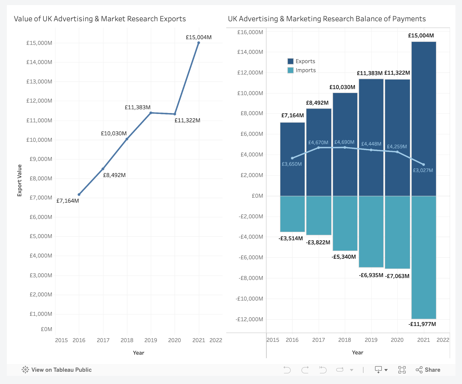
Advertising (which I’m lumping together with market research because that’s how it’s categorised in the national accounts) was worth ~£23 billion of Gross Value Added in 2023, representing 1% of UK economic output.1 It has consistently outpaced the growth of the wider economy since 1990 as the chart below shows.
The UK is also a net exporter of advertising services. Total exports topped £15 billion in 2021 having doubled since 2016. To put that in context the sector generates about three times the value of Scotch whisky exports, the subject of last week’s post. As I've written before, services trade has been much less affected by the UK’s decision to leave the EU, and the advertising stats are evidence of this.
Value of UK advertising exports
I like to think this success is because of the natural creativity and wit of the British people, although as with other service sectors, I’m sure the English language and a favourable time zone have something to do with it too.
On objective measures though the UK does appear to have some real strengths. It consistently ranks in the top three countries for the BestAds Rankings (hats off to Australia, which smashes it on a per capita basis) and in 2024 retained the second place ranking for awards received at Cannes Lion, the Oscars of advertising, so I’m told. FTSE 100 listed WPP is also one of the largest advertising agency groups in the world.
However, all this creative flair can sometimes come unstuck, and particularly so when companies try to thread the needle between traditional and British, and modern and global. This is where Jaguar sits now and it’s where others have got in trouble before. Below are a few shockers over the years.
Aberdeen
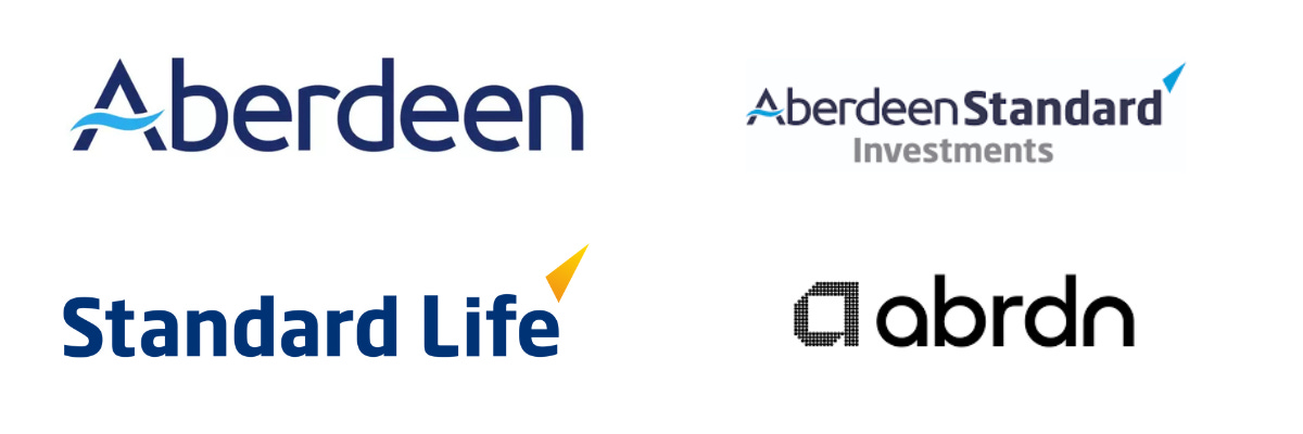
In 2017 UK asset manager, Aberdeen, and insurance company, Standard Life, merged to create Standard Life Aberdeen. The merger was fraught from the start but in April 2021 the company hoped to turn a new corner, changing its name to Abrdn (ABDN.LN) as “part of a modern, agile, digitally-enabled brand”. To this day I don’t know how the name has survived.
British Airways
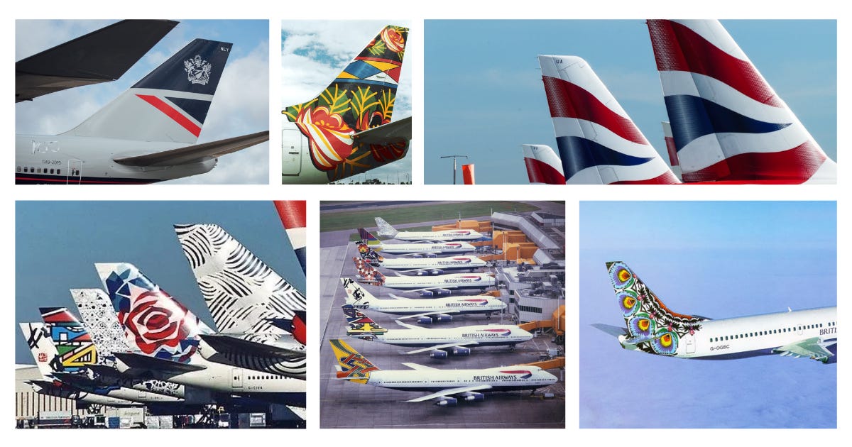
A personal favourite, if only because it became an airport pastime to identify the most awful design, was British Airways (IAG.LN) ill-advised world images foray. Seeking to present itself as a leading global airline, in 1997 BA replaced its coat of arms with a series of images designed by artists from around the world. Cultural appropriation wasn’t quite such a term back then but the design still felt, well wrong, especially when juxtaposed against the British branding at the front of the plane. Needless to say it was a disaster, roundly criticised by the public, the media and Margaret Thatcher. £60 million later and BA started replacing all the images with the wavy British flag.
Burberry
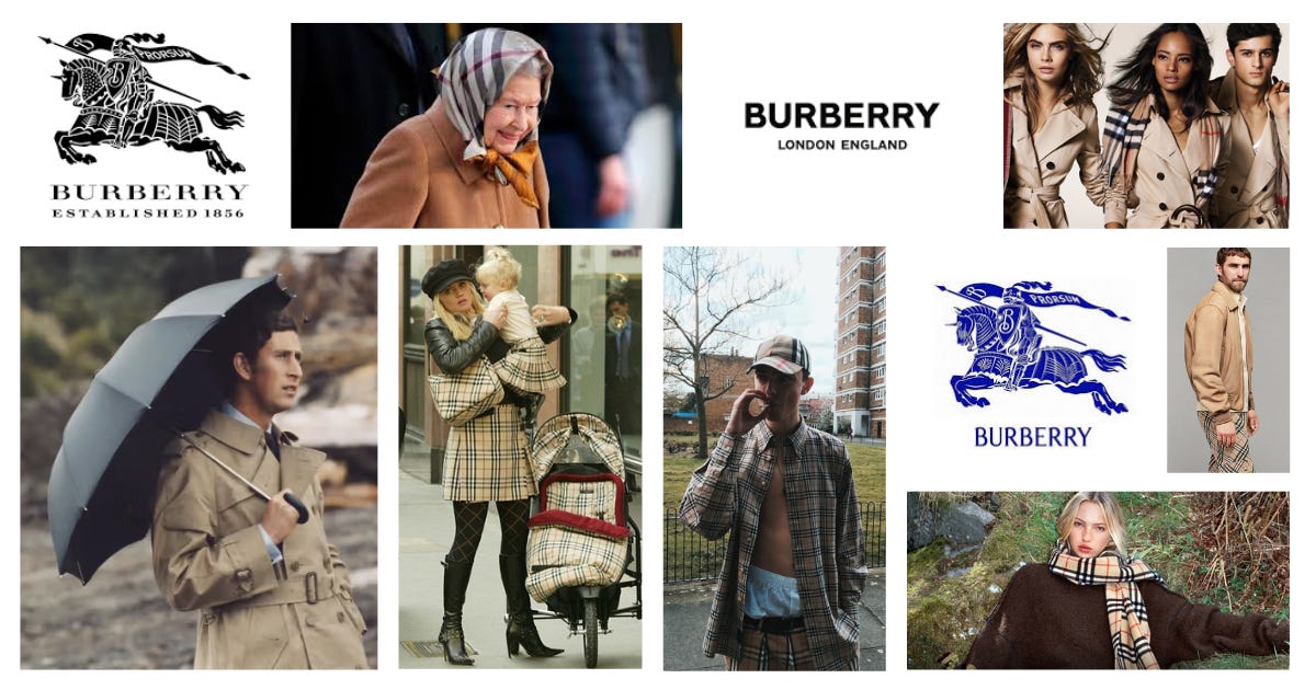
Burberry (BRBY.LN) is an interesting one because it is as likely to appear in lists of best rebrands, as it is in a list of the worst. The historic maker of trench coat’s brand took a nose-dive down the class spectrum in the 2000s, when it became symbolic of “chavs”, aka white working-class youth in the UK. It hit a low with the Daniella Westbrook baby-clad in Burberry picture, a far cry from Prince Charles looking dapper in mid-80s trench coat glory.
The brand then staged a remarkable comeback, first by reigning in the fakes and licensed products that had proliferated in the chavtastic era, and then leaning into a modern Brit vibe with campaigns featuring British actors and models. In recent years though it lost its way again, trying to move up the luxury ladder into the lucrative world of handbags. This has been a costly failure and Burberry is once again “returning to its roots” with a focus on classic British weatherproof wear of the expensive but at a stretch affordable kind.
Along the way Burberry changed its branding – dropping the knight in armour in favour of a generic flat font, before returning to the knight to emphasise its heritage and roots. I’m no luxury expert but this back and forth seems to symbolise wider strategy woes of a brand always caught between the traditional and the modern. Some parallels for Jaguar, no doubt. As to whether Burberry’s a good buy today, you can read more here.
Department for Business Stuff
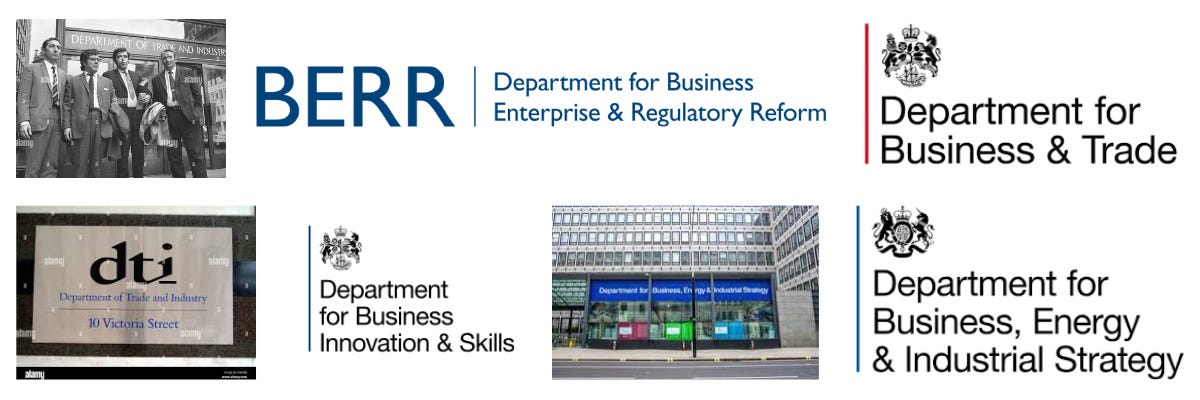
Betraying my civil service past while continuing the theme of how branding mishaps reflect wider strategic confusion, the endless rebranding of the UK’s “department for business stuff” is a good one. Over the last fifty years – but mainly over the last twenty - we’ve had energy policy in and out, trade policy in and out, industrial strategy added now and then. There was also a one-week period in 2005 where it was called the Department for Productivity, Energy and Industry, but this was widely ridiculed as “dippy” and swiftly abandoned.
In no small part this reflects the UK government’s approach to business, which since the 1970s has eschewed longer-term industrial strategy style planning, leaving the “department for business stuff” with a limited remit and budget. It’s also a function of how Whitehall works, with the Treasury taking the lead on a lot of business and economic policy questions; and a function of how changing a name is easy, while changing what gets done is hard. The current iteration is the Department for Business and Trade, although I’d personally support leaning back into the brand’s heritage with a return to the Department of Trade and Industry.
Jaguar
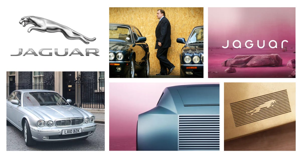
You say Jaguar, I say… Margaret Thatcher in an 80s saloon car, John Prescott in two of them ten years later. Despite all the stick that Jaguar’s new purple-hued theme has got, I’m not convinced this is a total dud. Jaguar is the J in Jaguar Land Rover, which is the largest car manufacturer in the UK, and the only major one that you can argue is a British company (it’s owned by Indian group Tata, but it’s headquarters, bulk of manufacturing and expertise are all firmly rooted in the UK).
Jaguar has long been the problem child of the group, failing to sell enough cars to compete with Audi and BMW in the volume luxury segment, and losing money on every vehicle sold. A new strategy to go all electric was announced in 2021 and this rebrand is the first phase of that launch, with a car to follow next year. Jaguar clearly had to do something but there’s worrying parallels with BA and Burberry here in veering too far from its heritage. Jury’s out.
Royal Mail
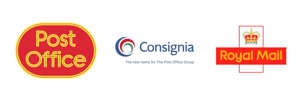
“Consignia: Nine letters that spell fiasco” is the headline that stood out when reading about this one. In 2001 the Post Office Group in the UK rebranded as Consignia to reflect the wider range of services offered and as a foundation for overseas expansion. The underlying brand names of Royal Mail (delivering letters), Post Office (running branches) and Parcelforce (delivering parcels) were retained - the idea in part to clear up confusion between what Post Office and Royal Mail did. But this was messing with brands that the whole UK population had known since birth, and so everyone absolutely hated it. The company was forced to retreat a year later.
Despite the backlash and the swift reversal, I think this one has held up better with time. Both Facebook and Google have funky group names that function as umbrella terms for different operating activities. And in 2022 Royal Mail changed its group name to reflect a more diversified and global business, now trading as International Distribution Services (IDS.LN). Perhaps the mistake was not to change the group name, but to make a big deal out of it.
The UK Passport
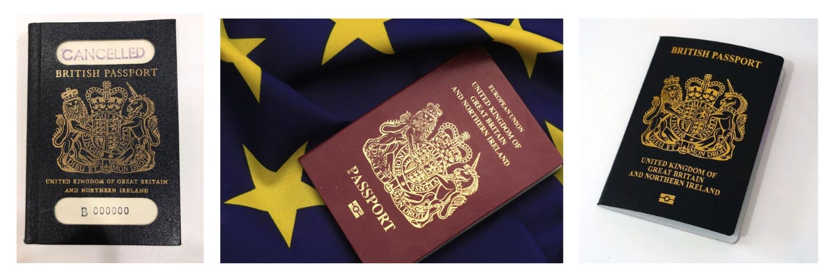
Going further down the political wormhole, the worst rebrand of the last decade may well be the British passport. Older generations had long lamented the loss of the black British passport for a burgundy EU number. Younger generations couldn’t care less. But we got Brexit and in turn we got a rebranded passport. Only this one isn’t quite as useful because it doesn’t allow us to live and work in 27 EU countries plus Switzerland. We are where we are.
Statistics for the “Advertising and market research” refer to SIC sector 72: Advertising and Market Research
The apology the Evening Standard printed when accused by Abrdn of bullying always makes me smile.